



Mastering YouTube Title & Thumbnail A/B Testing (TubeBuddy Style)
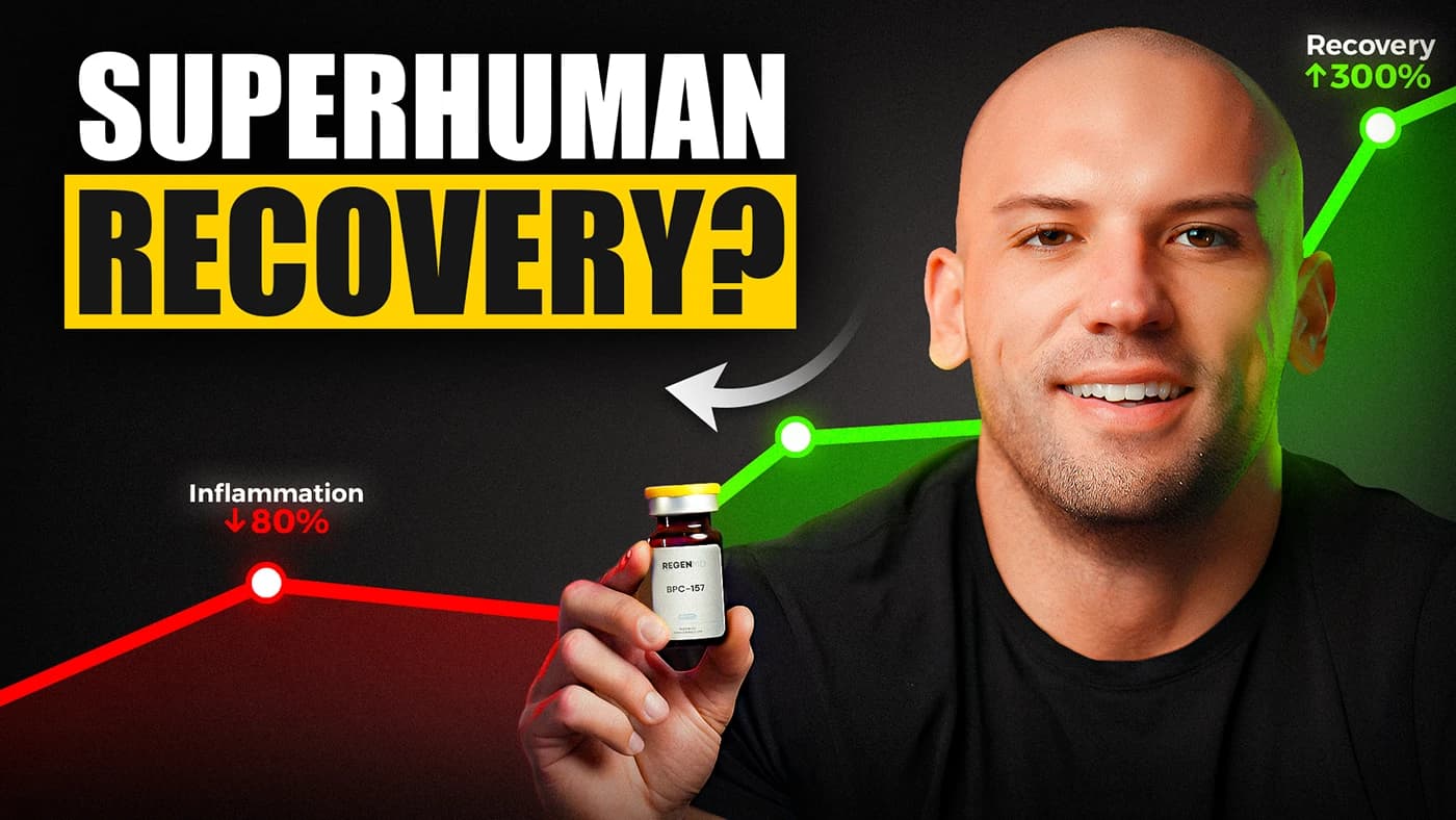
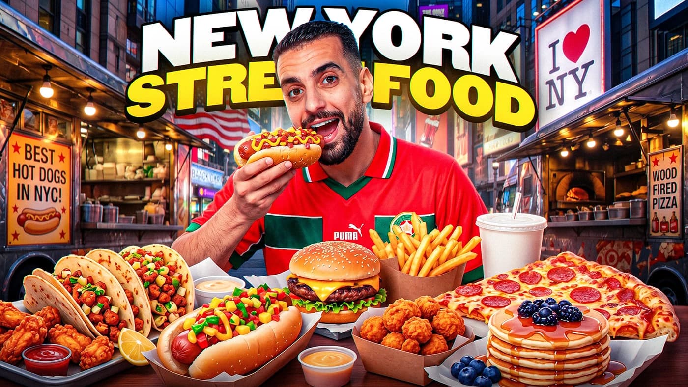
How top creator channels test curiosity hooks, thumbnail focal points, and mobile readability to increase CTR from 4% to 10%+.
A video can have brilliant pacing, cinematic color, and pristine sound design — but if nobody clicks the thumbnail, zero watch time is generated. Click-Through Rate (CTR) is the primary gatekeeper of YouTube recommendation velocity.
TubeBuddy pioneered automated A/B testing on YouTube, proving that switching a weak title or low-contrast thumbnail can instantly resurrect older videos and multiply new upload views by 2x to 5x.
Fojx.Com's A/B CTR Simulator lets creators preview two competing packaging concepts side-by-side inside pixel-accurate mockups of YouTube's Mobile Feed, Desktop Search, and Sidebar Recommendations before risking their upload.
Click-Through Rate & View Multiplication Impact
Views = Total Impressions × CTR
Lift = ((Variant B CTR - Variant A CTR) ÷ Variant A CTR) × 100
Variable Breakdown & Logic:
- •If a video receives 1,000,000 impressions at a 4.0% CTR, it generates 40,000 views.
- •Improving that thumbnail to achieve an 8.0% CTR on the same 1,000,000 impressions generates 80,000 views — a 100% gain with zero extra filming.
TubeBuddy 4-Stage A/B Testing Framework
Formulate a Single Testing Hypothesis
Test one variable at a time: either test two different emotional title hooks, or test two visual thumbnail styles (e.g. face closeup vs. object intrigue).
Verify Mobile Contrast & Text Legibility
Over 75% of YouTube views occur on mobile screens. Ensure thumbnail text is no more than 3 words and readable at postage-stamp size.
Test Curiosity Gaps vs. Direct Answers
Variant A can promise an unexpected reveal ('Here is what happened...'), while Variant B presents a contrarian warning ('Do NOT do this...').
Monitor 24-Hour Studio Impression Velocity
If your initial upload CTR is below your channel's 30-day average after 24 hours, swap in Variant B immediately.
- ✕Putting more than 4 words of text on a thumbnail, making it unreadable on smartphones.
- ✕Replicating the exact title text on the thumbnail image instead of using complementary curiosity hooks.
- ✕Testing two nearly identical thumbnails that don't trigger different psychological reactions.
- ✓Always squint your eyes when looking at the mockup — if the central focal point isn't immediately obvious, simplify the design.
- ✓Pair high-saturation warm colors (yellow, red, orange) with dark high-contrast backgrounds for maximum scroll-stop rate.